03 — Visual Work
Brand in action.
Sal had a logo that worked, but it wasn’t doing the job. After a decade in the solar industry, his business had grown into something that deserved a sharper, more refined identity — one that communicated trust and professionalism at first glance.
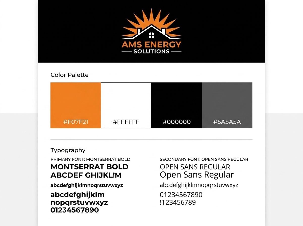
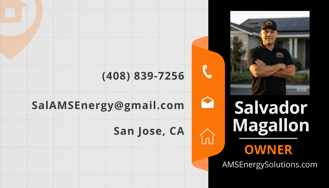
We revamped the existing AMS mark — retaining the orange sunburst energy of the original while tightening the execution. The result is a cleaner, more modern logo that holds up in print, on screen, and in the field. Alongside the mark, we developed a complete brand guide and produced print-ready business cards featuring Sal’s photo and contact information.
The brand system now gives Sal a consistent foundation to build on — whether he’s closing a deal or leaving a card on a job site.
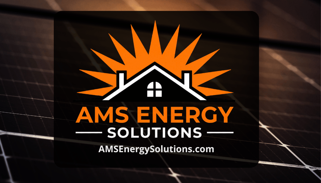
The existing AMS sunburst mark cleaned up and modernized. Same brand equity, sharper execution — built to hold up at any size from favicon to truck decal.
Primary palette: #F07F21 orange, white, black, and #5A5A5A gray. Typography: Montserrat Bold for headlines, Open Sans for body. Clear usage rules for every context.
Front: Sal’s photo, phone, email, and location. Back: logo on the solar panel texture from the site. Print-ready files in hand before the next client meeting.
Every brand application now draws from the same locked palette — digital, print, and signage all speak the same visual language.
Bring the real constraint. We’ll give you a direct read on the connected system and whether Revelation is the right operator.
Start a Growth Conversation