03 — Visual Work
The brand in every form.
Jacob Heffernan came to Revelation with a stock logo and a basic business card. No brand system, no visual language, no way to present himself as a premium contractor in a commodity market.
We worked directly with Jacob to define his brand positioning — premium, trustworthy, local — and then built a complete identity system designed to hold up across every touchpoint: digital and physical, first impression and repeated exposure.
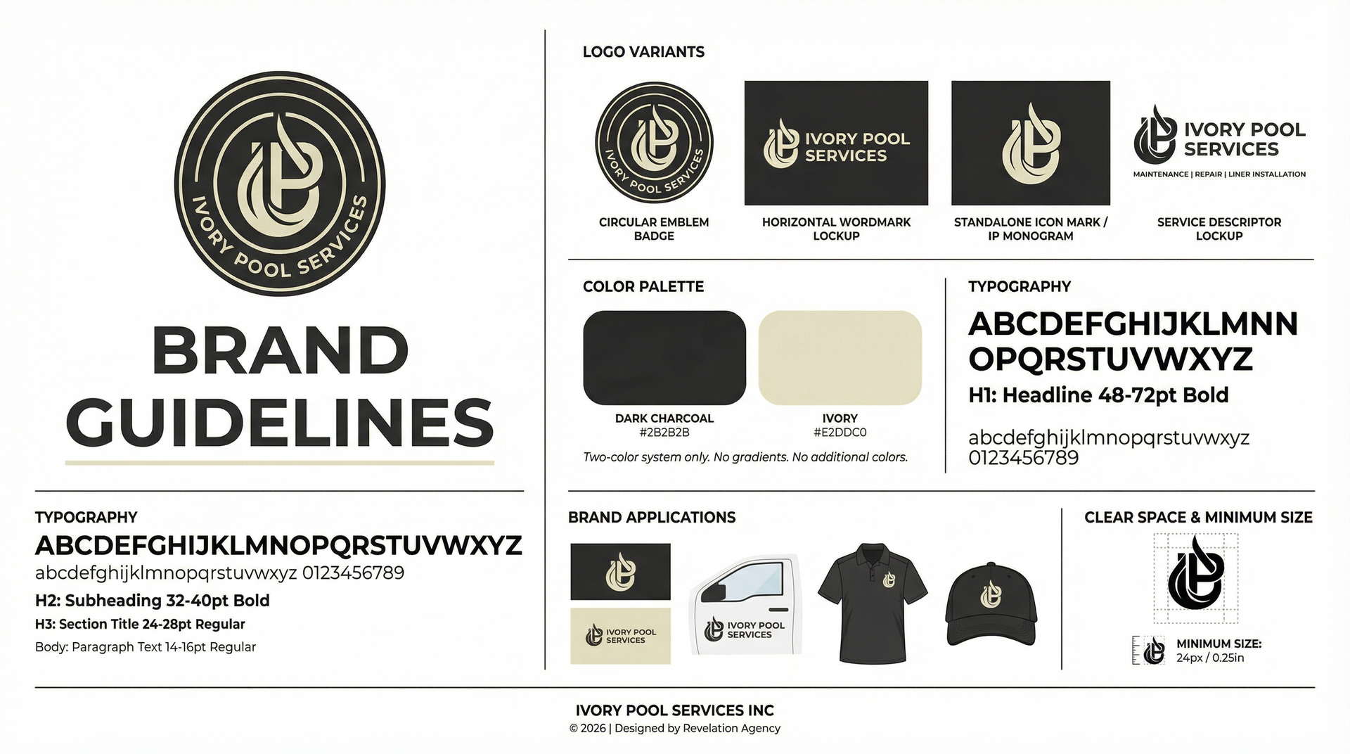
The result is a two-color system (Dark Charcoal #2B2B2B + Ivory) that commands authority without shouting. Every application — truck decal, polo, A-frame sign, business card — runs through the same system. One brand, everywhere Jacob works.
Four mark variants: circular emblem badge, horizontal wordmark lockup, standalone icon mark, and service descriptor lockup — every context covered.
Two-color system only — Dark Charcoal + Ivory. No gradients, no additional colors. Typography hierarchy from 48pt headline to 14pt body, fully documented.
A complete brand guide governing logo usage, clear space, minimum size, color palette, typography, and brand application standards.
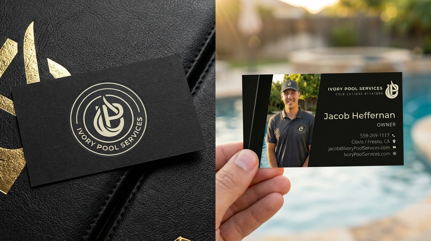
Front and back design — Jacob's photo, contact details, license number. Dark matte with ivory foil treatment for a premium tactile impression.
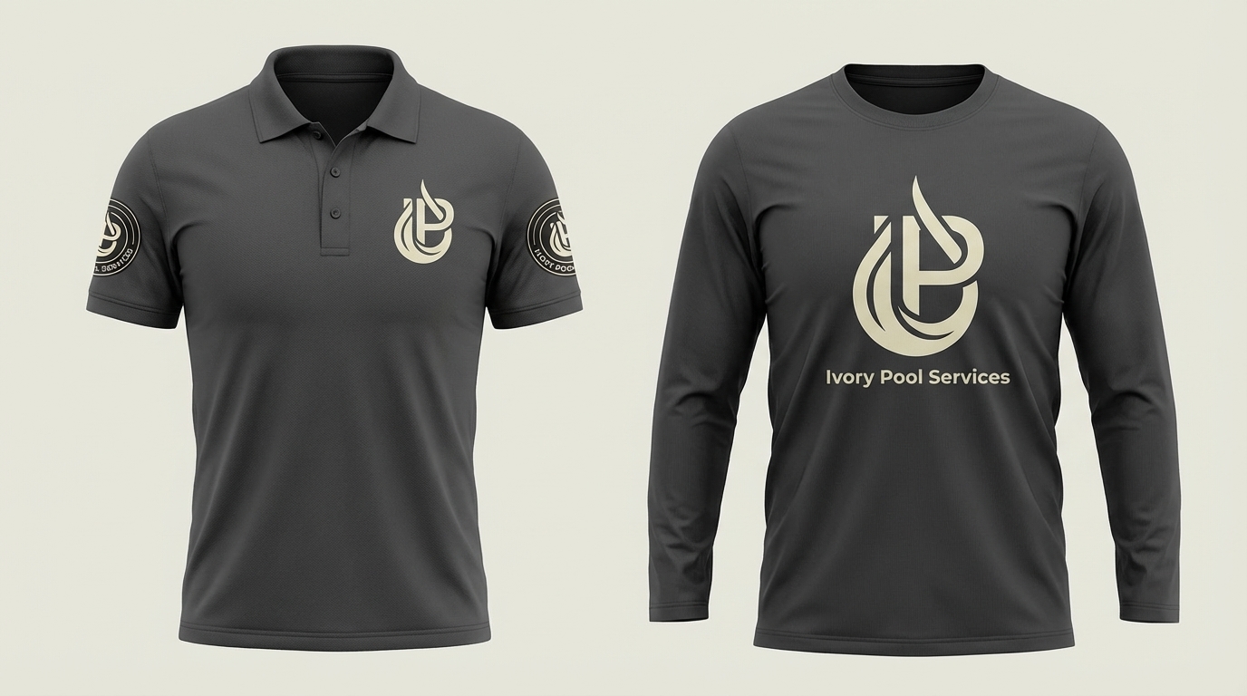
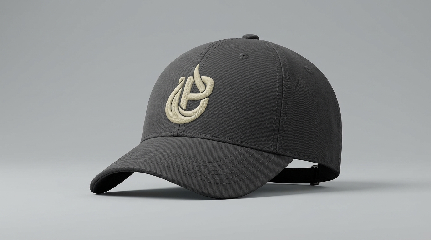
Polo shirt, long-sleeve work shirt, and hat — all carrying the emblem mark. Every job site becomes a brand moment.
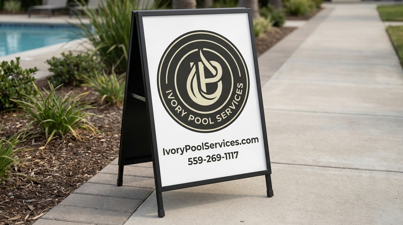
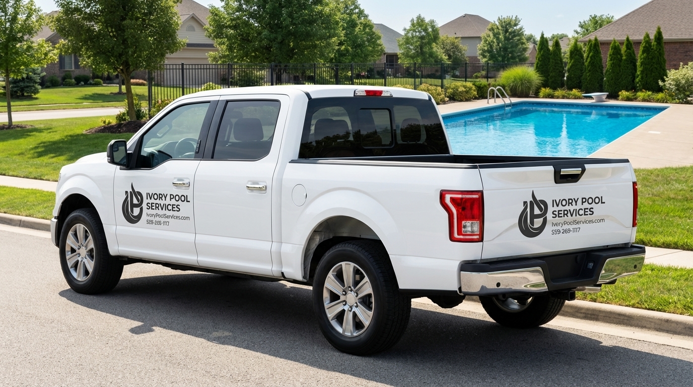
Custom truck decals and an A-frame sign — turning every service call into a neighborhood impression that outlasts the visit.
The complete engagement — brand, website, and bilingual video together.
Fully custom-coded website at IvoryPoolServices.com built to convert Central Valley homeowners.
English and Spanish brand videos for the full Central Valley market.
Bring the real constraint. We’ll give you a direct read on the connected system and whether Revelation is the right operator.
Start a Growth Conversation