03 — Visual Work
The brand in every form.
Jacob Heffernan came to Revelation with a stock logo and a basic business card. No brand system, no visual language, no way to present himself as a premium contractor in a commodity market.
We worked directly with Jacob to define his brand positioning — premium, trustworthy, local — and then built a complete identity system designed to hold up across every touchpoint: digital and physical, first impression and repeated exposure.
The result is a two-color system (Dark Charcoal #2B2B2B + Ivory) that commands authority without shouting. Every application — truck decal, polo, A-frame sign, business card — runs through the same system. One brand, everywhere Jacob works.
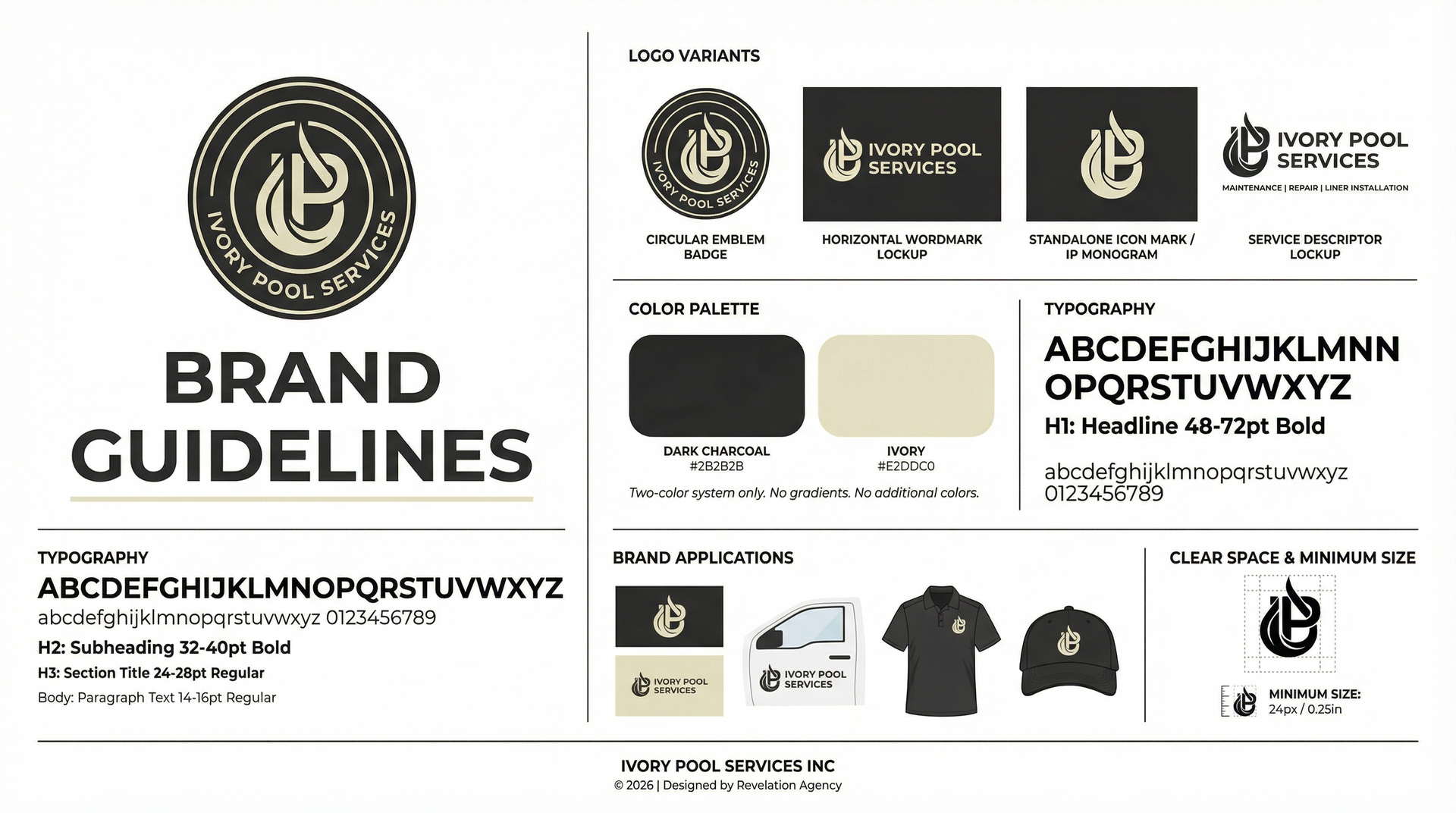
Four mark variants: circular emblem badge, horizontal wordmark lockup, standalone icon mark, and service descriptor lockup — every context covered.
Two-color system only — Dark Charcoal + Ivory. No gradients, no additional colors. Typography hierarchy from 48pt headline to 14pt body, fully documented.
A complete brand guide governing logo usage, clear space, minimum size, color palette, typography, and brand application standards.
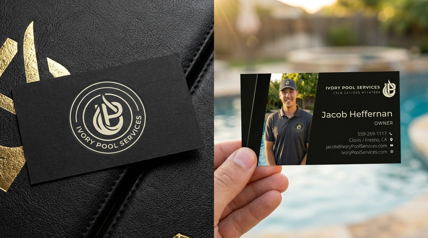
Front and back design — Jacob's photo, contact details, license number. Dark matte with ivory foil treatment for a premium tactile impression.
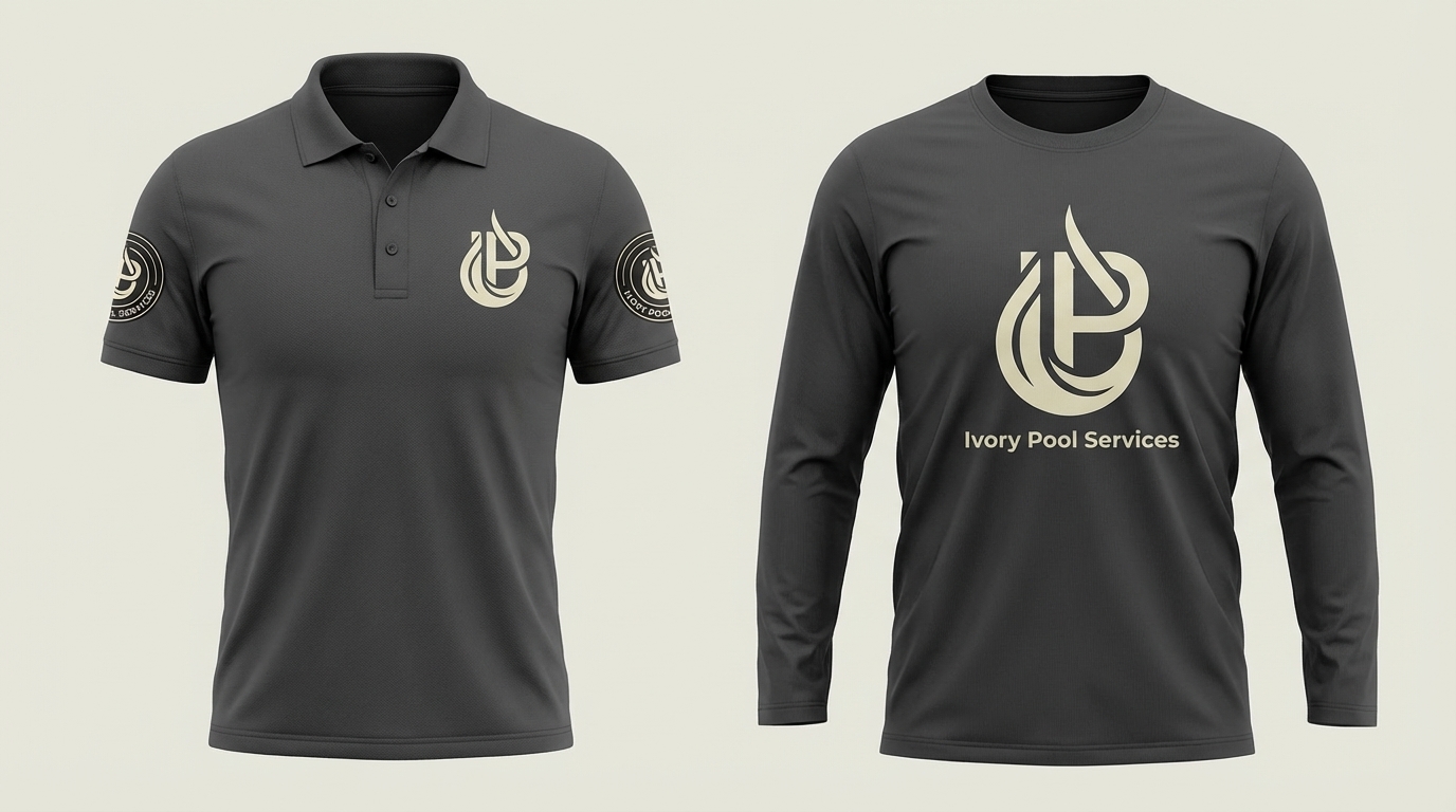
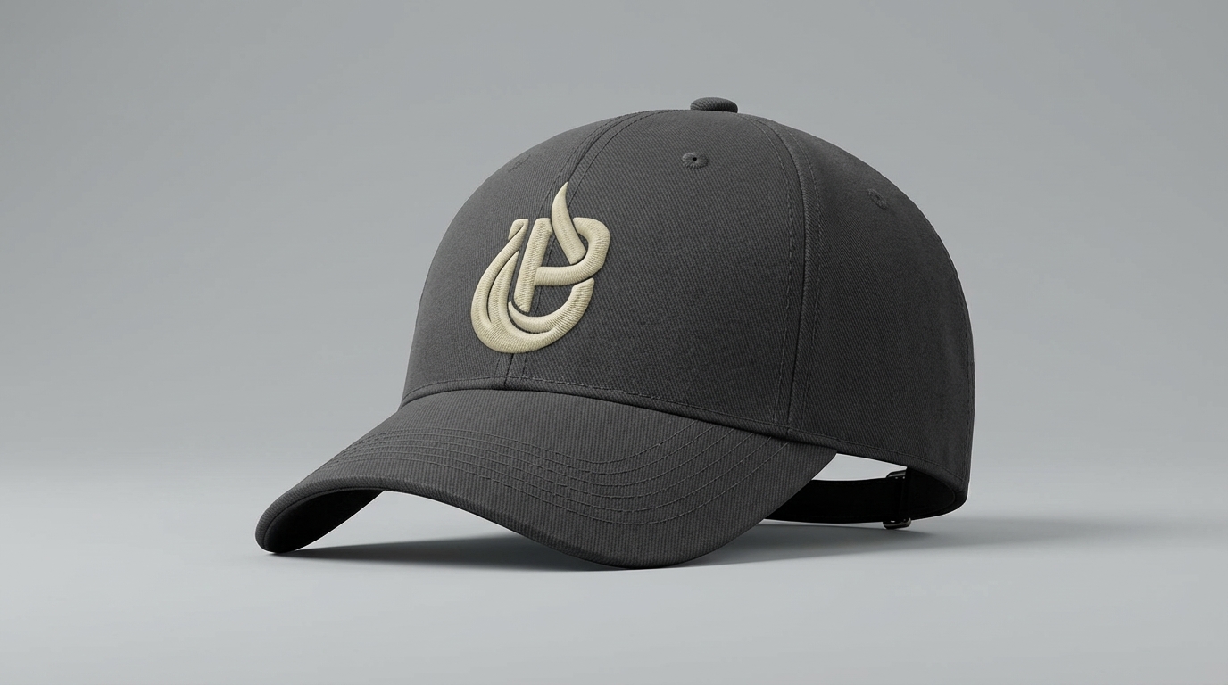
Polo shirt, long-sleeve work shirt, and hat — all carrying the emblem mark. Every job site becomes a brand moment.
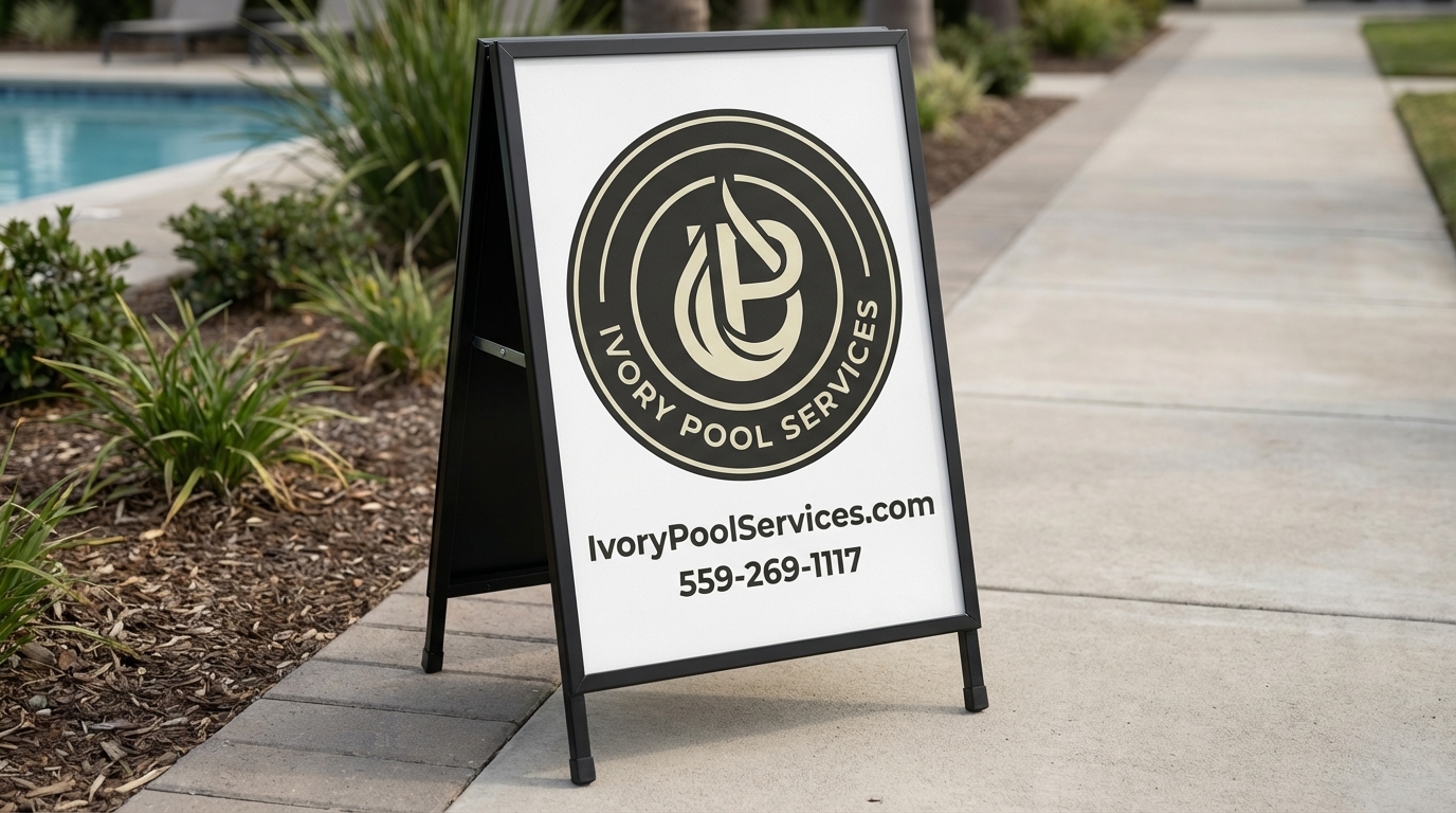
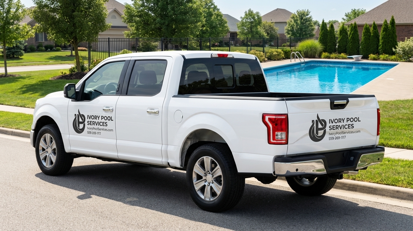
Custom truck decals and an A-frame sign — turning every service call into a neighborhood impression that outlasts the visit.
The complete engagement — brand, website, and bilingual video together.
Fully custom-coded website at IvoryPoolServices.com built to convert Central Valley homeowners.
English and Spanish brand videos for the full Central Valley market.
Thirty minutes. Real strategy. No pitch. Walk away with clarity on what’s broken and whether we’re the right partner.
Book Your Free Session